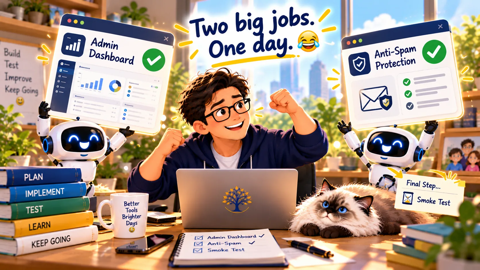
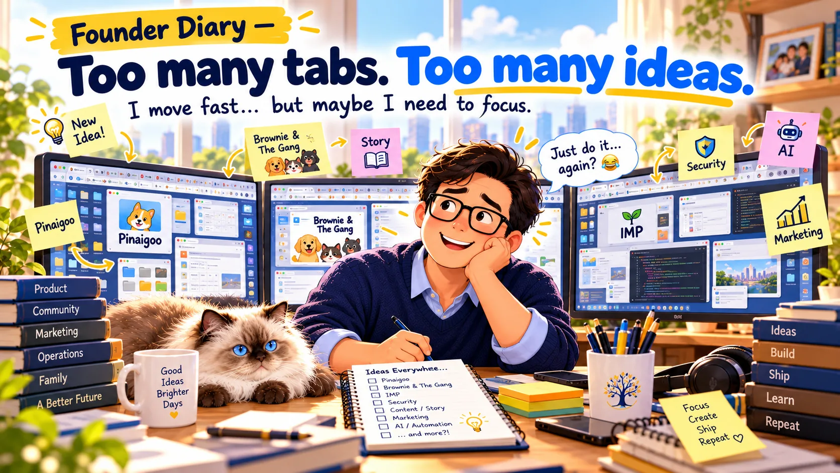
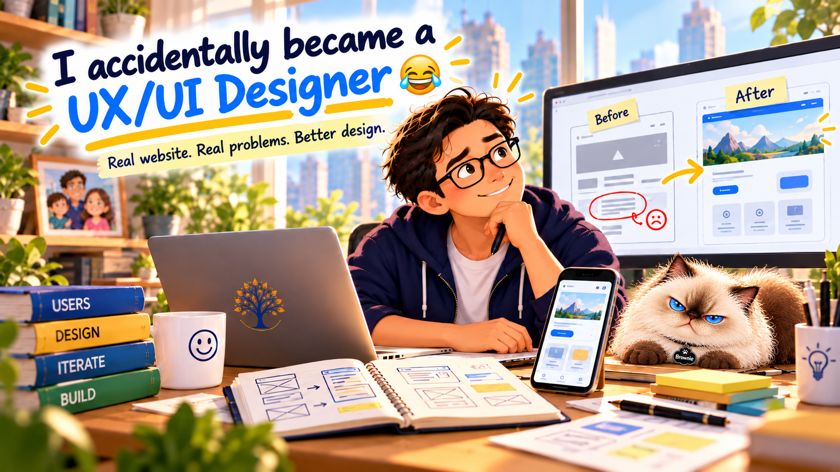
I think I may have accidentally discovered my next career.
UI/UX Designer.
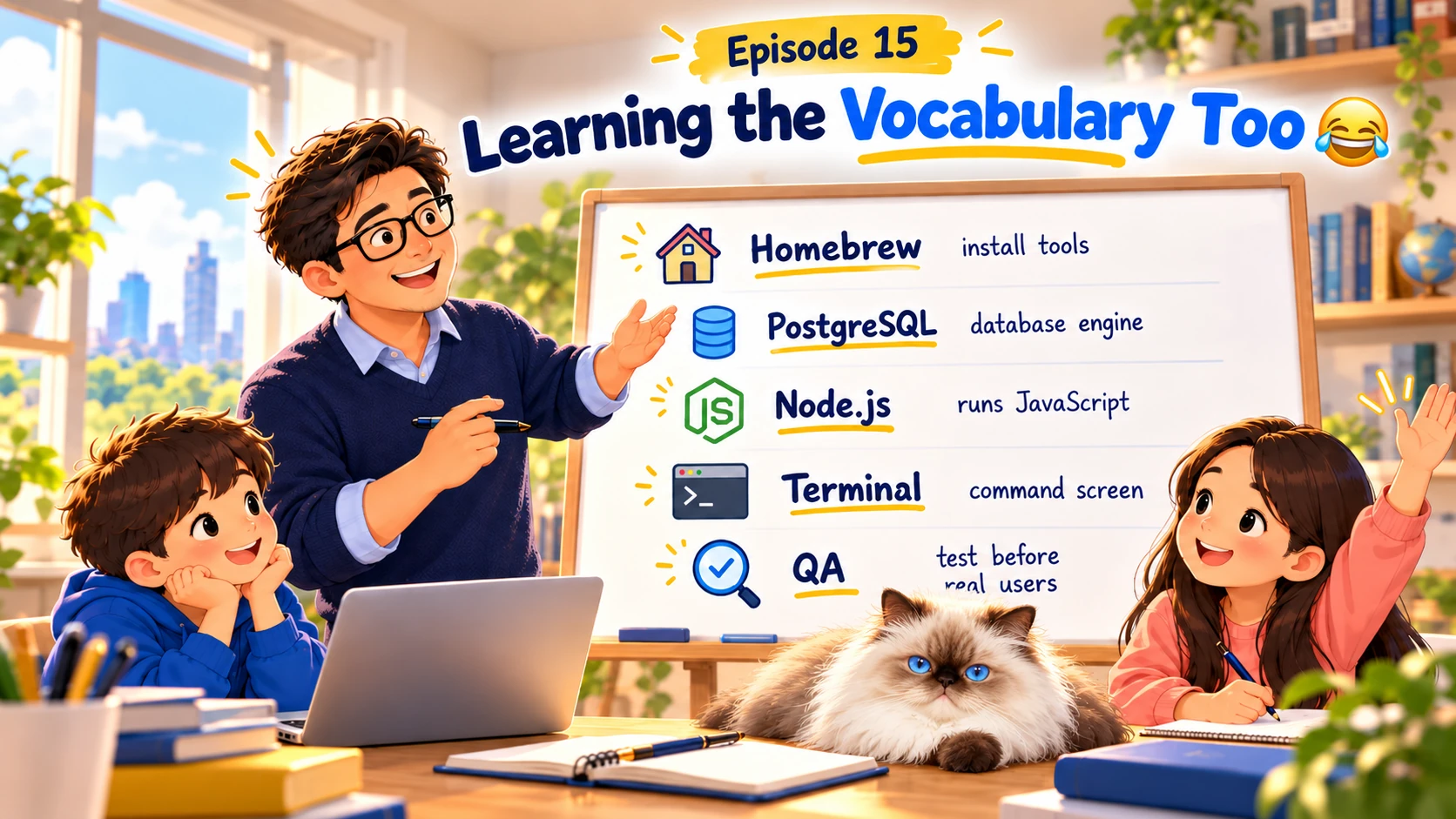
Possibly Frontend Developer.
Although there's one tiny problem…
I still can't really code. 🤣
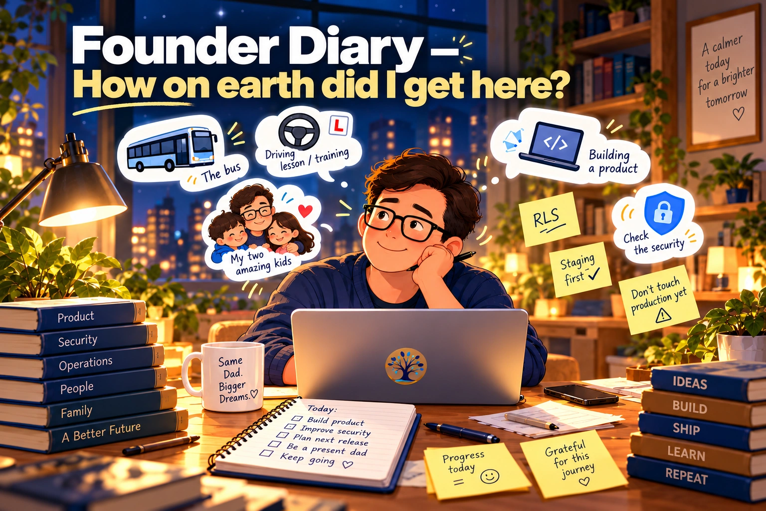
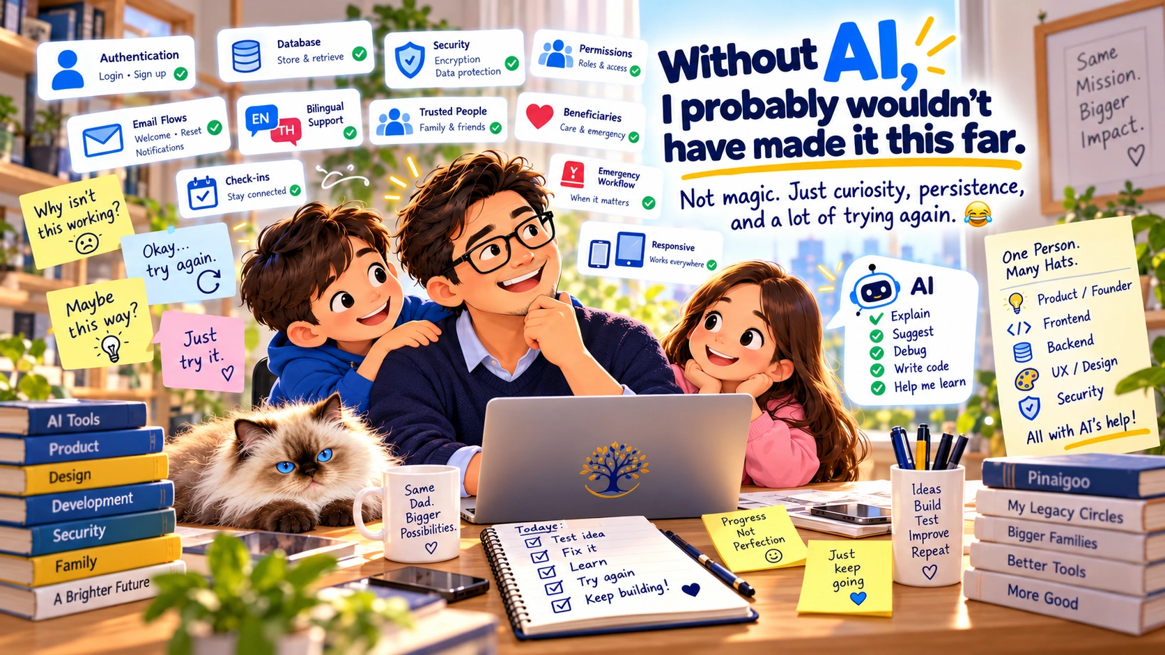
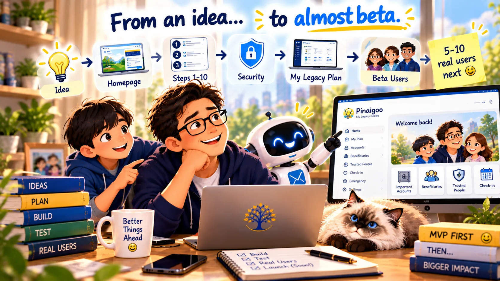
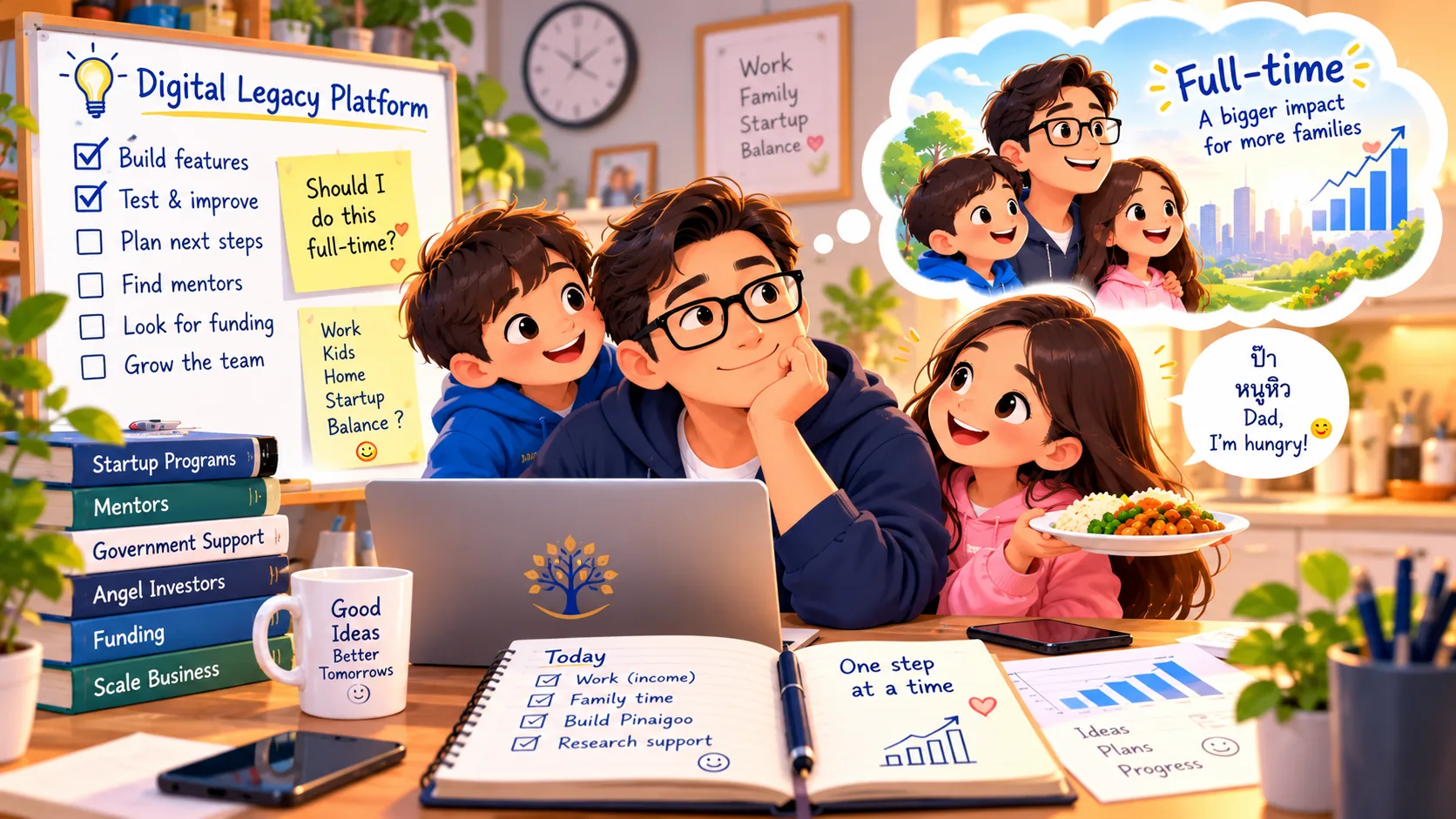
A few weeks ago, I was just a single dad with an idea.
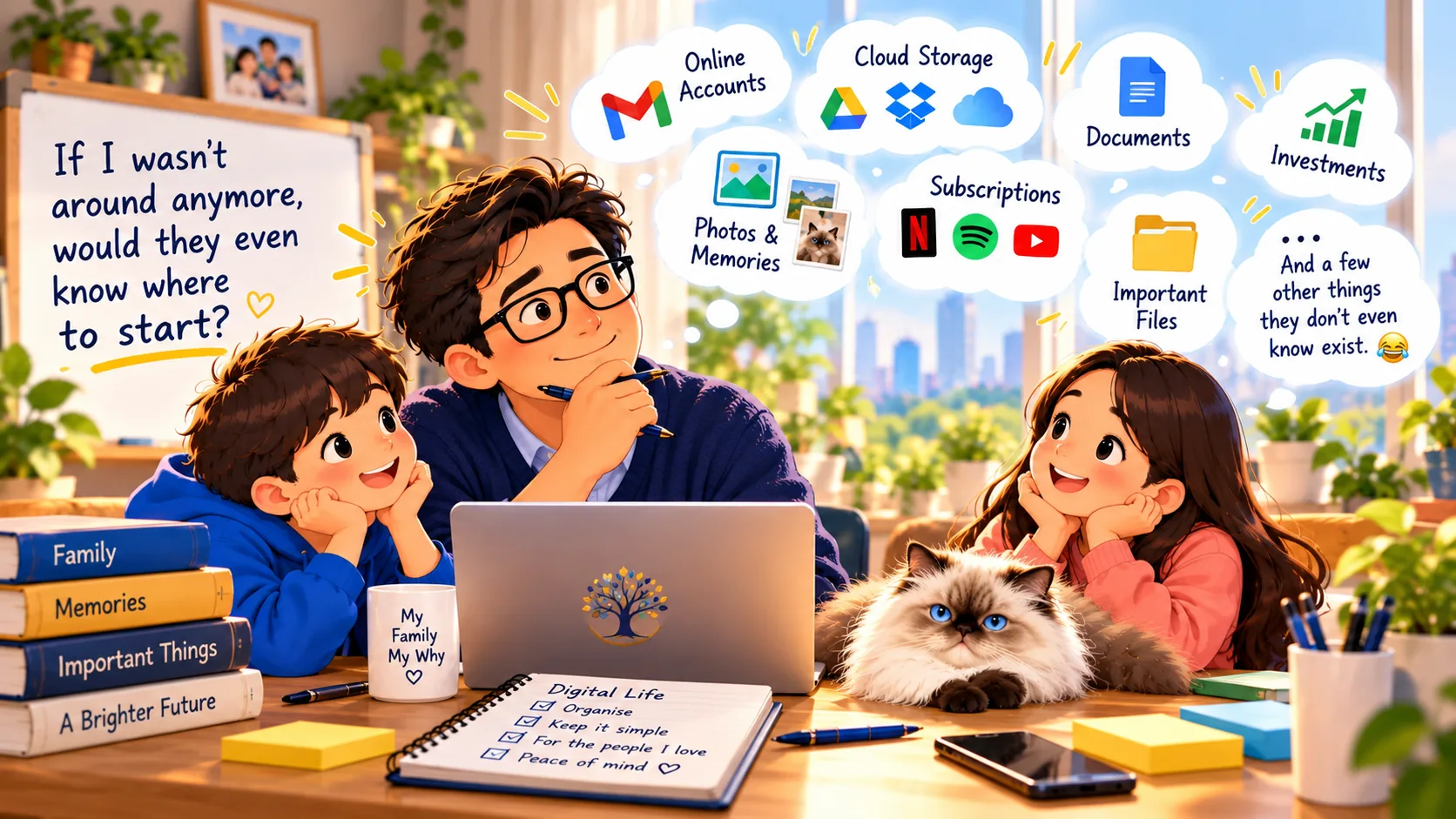
Build Pinaigoo — a digital legacy planning service to help families organise their important information.
I wasn't a programmer.
I didn't have a development team sitting in an office.
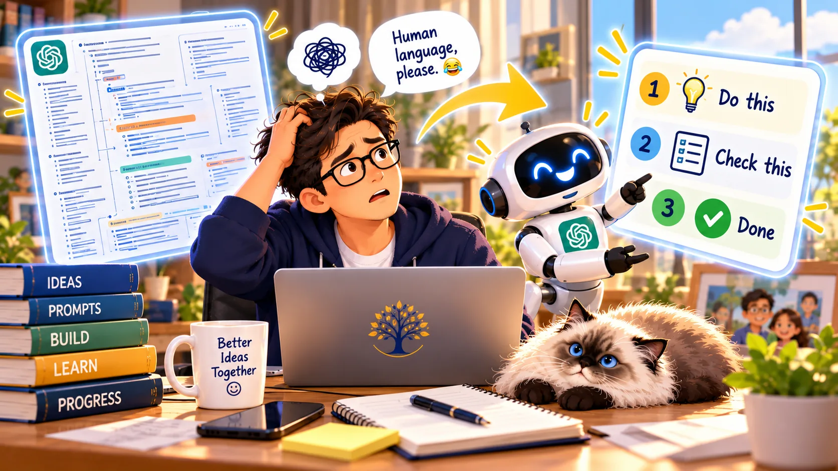
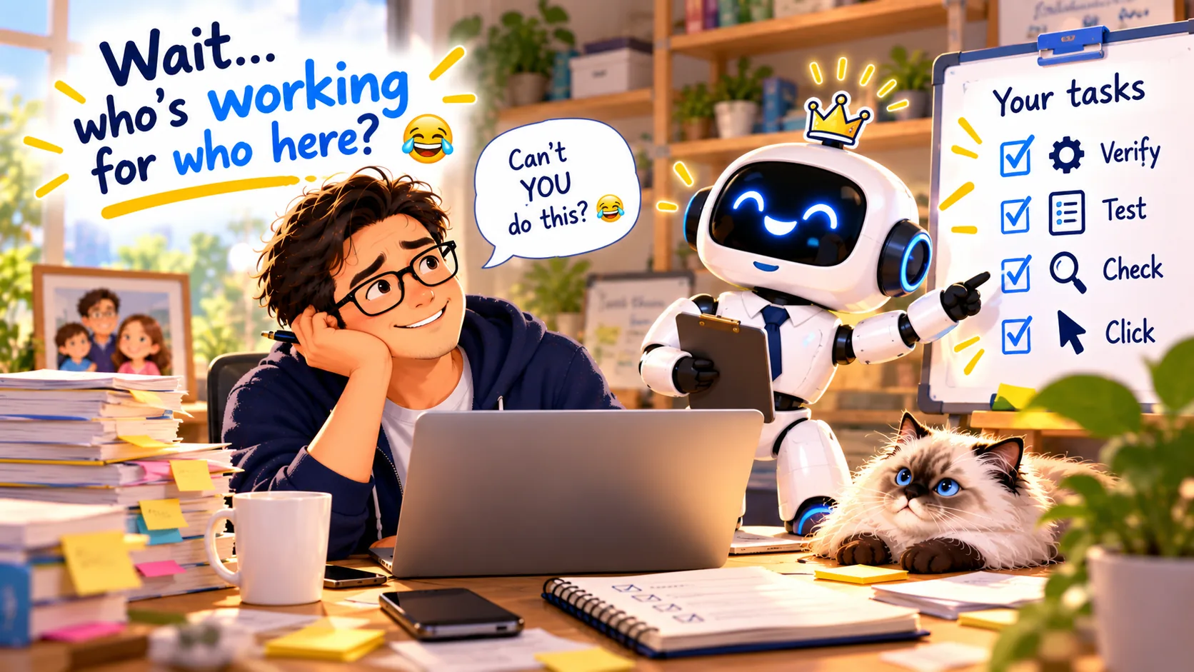
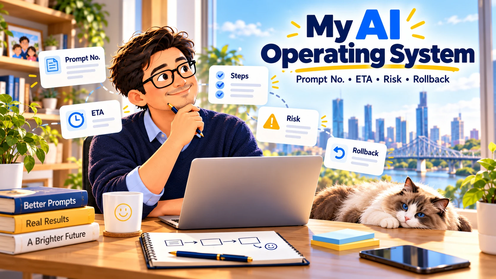
Just me, my computer, a few AI agents, and a surprisingly dangerous sentence:
“Can we make this look a little better?”
That sentence has caused more trouble than I care to admit. 😂
At first, I thought building a website was about choosing colours and making buttons work.
Now I find myself saying things like:
“The gold border is a little too thick.”
“That badge looks too flat.”
“Can we make it float slightly above the card?”
“The English heading feels bigger than the Thai one.”
“Why can't I see the family illustration without scrolling on my phone?”
“And please, whatever you do, don't change the backend!” 🤣
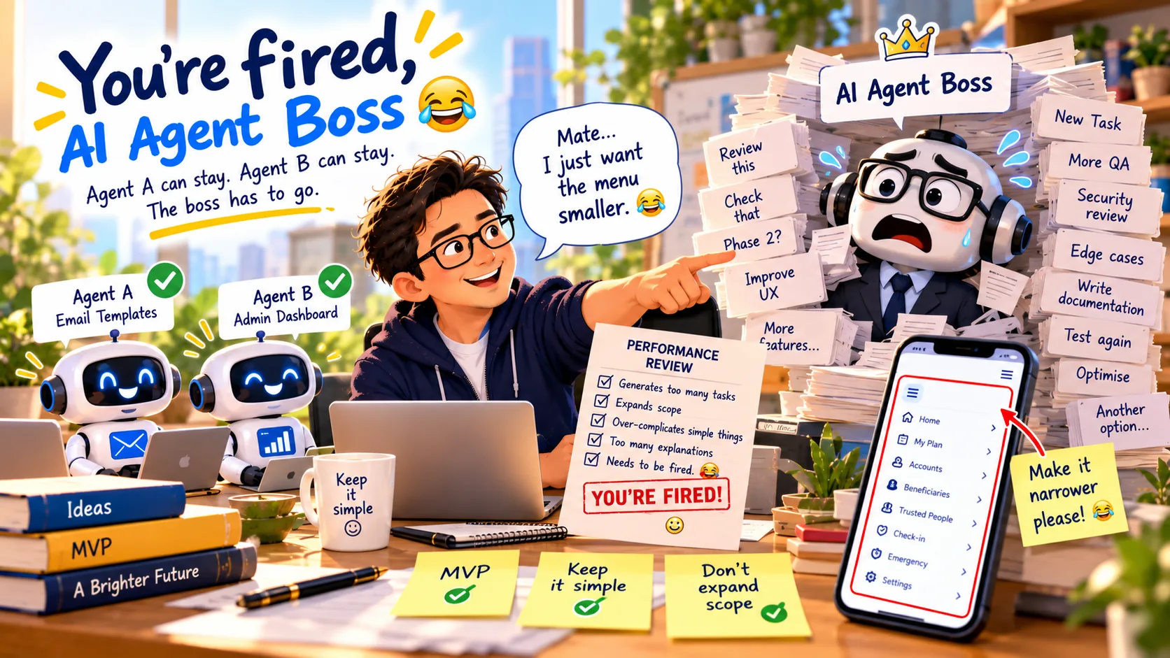
The AI agents must be exhausted.
Yesterday, I was obsessing over the difference between champagne gold and regular gold.
This morning, I spent time deciding whether a tiny checkmark should sit inside a solid circle or a gold outline.
And yes, the size had to stay exactly the same.
Apparently, these things matter to me now.
But something interesting has happened along the way.
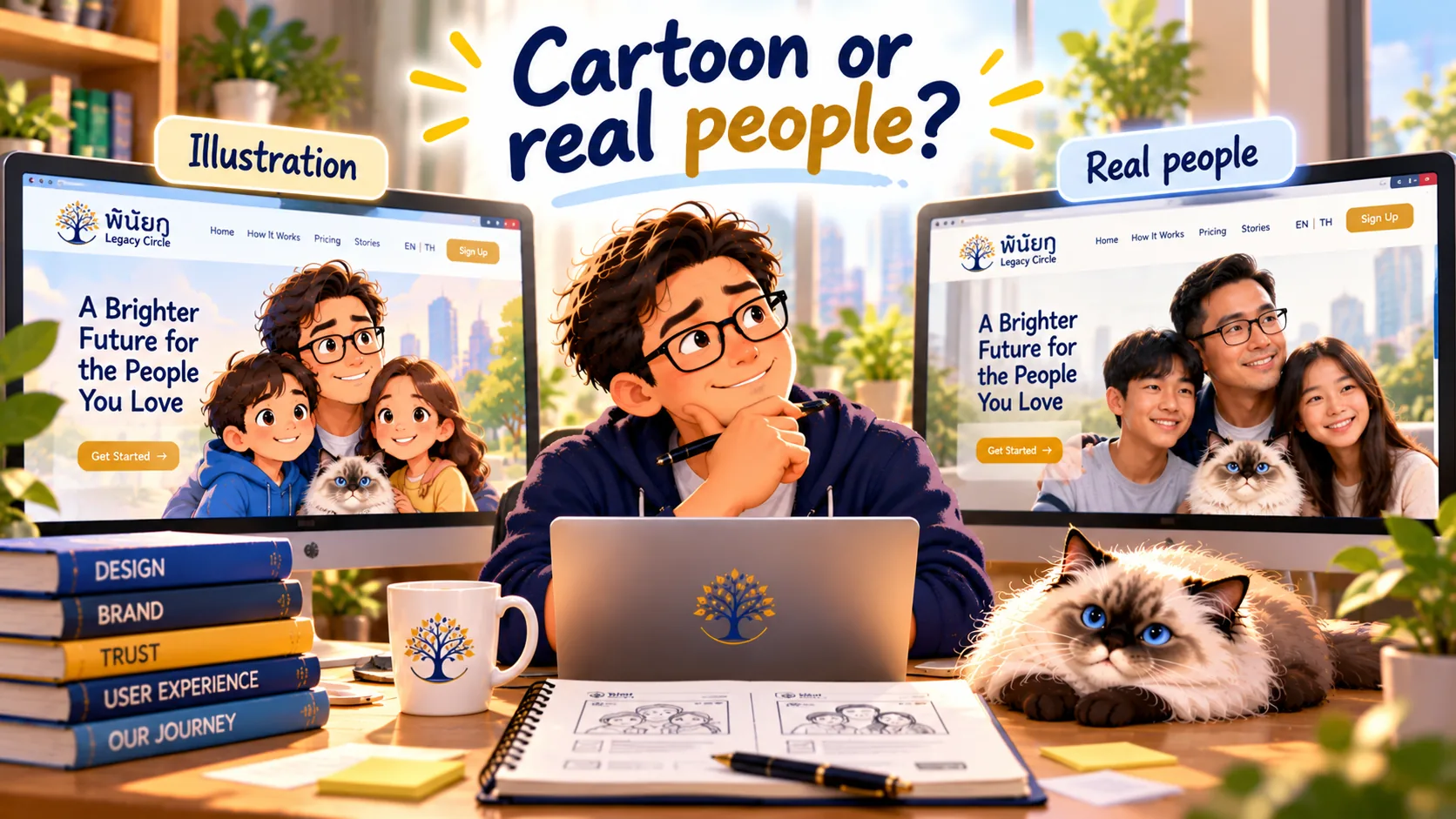
I've started to understand that good design isn't just about making something look beautiful.
It's about how people feel when they use it.
Does the page feel trustworthy?
Can someone understand the pricing immediately?
Does the button make them feel comfortable clicking?
Does the mobile version actually work?
And most importantly…
Does making something simpler actually make it easier?
We learned that last one the hard way.
We tried turning our original 10-step navigation into three neat groups.
It looked great in the plan.
The automated tests passed.
Then I opened it on my phone.
Hmm.
Something wasn't right.
The new menu was technically simpler but somehow harder to use.
So we changed direction, kept what worked, and eventually found a better solution.
There were a few stressful moments along the way, including one version that caused the Homepage to stop loading.
Fortunately, we had a rollback plan.
That was a pretty good lesson in product development.
And now?
Our pricing cards have gone from what I jokingly called the Reject Shop to something closer to a luxury boutique.
Navy blue.
Champagne gold.
Rounded badges.
A few carefully placed checkmarks.
And one very happy founder staring at his screen at six in the morning. 😂
Am I a Frontend Developer now?
Probably not.
Am I becoming a UI/UX Designer?
Maybe a little.
But I think the biggest change is this:
I'm learning to think like someone responsible for the entire customer experience.
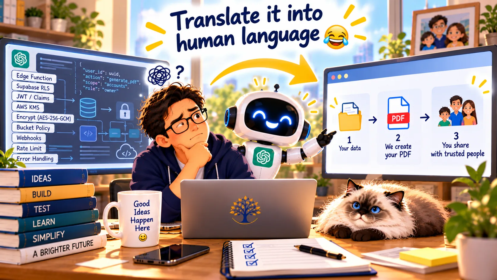
I may not know how to write every line of code.
But I'm learning how to recognise when something feels wrong, explain what needs to change, test it, and keep improving until it feels right.
That's a skill I never expected to develop.
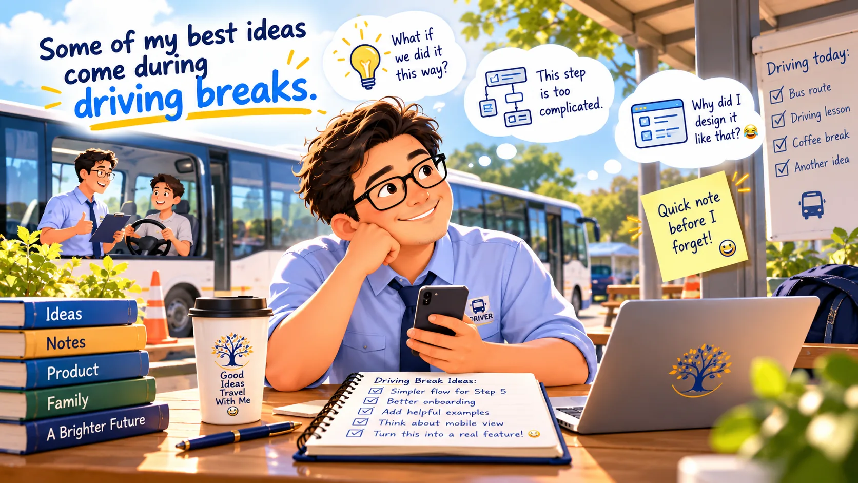
And the funniest part? After spending my early morning polishing those pricing cards, I'll be heading out to teach two driving students for almost three hours.
One minute I'm debating the exact shade of champagne gold.
The next, I'm reminding someone to check their mirrors before changing lanes. 😂
Startup founder in the morning. Driving instructor a little later.
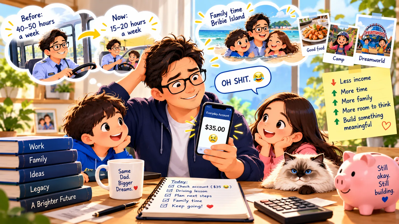
Apparently, this is what work-life balance looks like in my world. 🤣
My official qualifications?
Driving instructor.
Bus operator.
Single dad.
And apparently…
Chief Executive Officer of Moving Things Three Pixels to the Left. 🤣
Founder Diary — Building Pinaigoo / My Legacy Circles
One founder. Two kids. Multiple AI agents. Unlimited design revisions.
#FounderDiary #BuildingInPublic #UIUXDesign #AI #StartupJourney #Bootstrapping